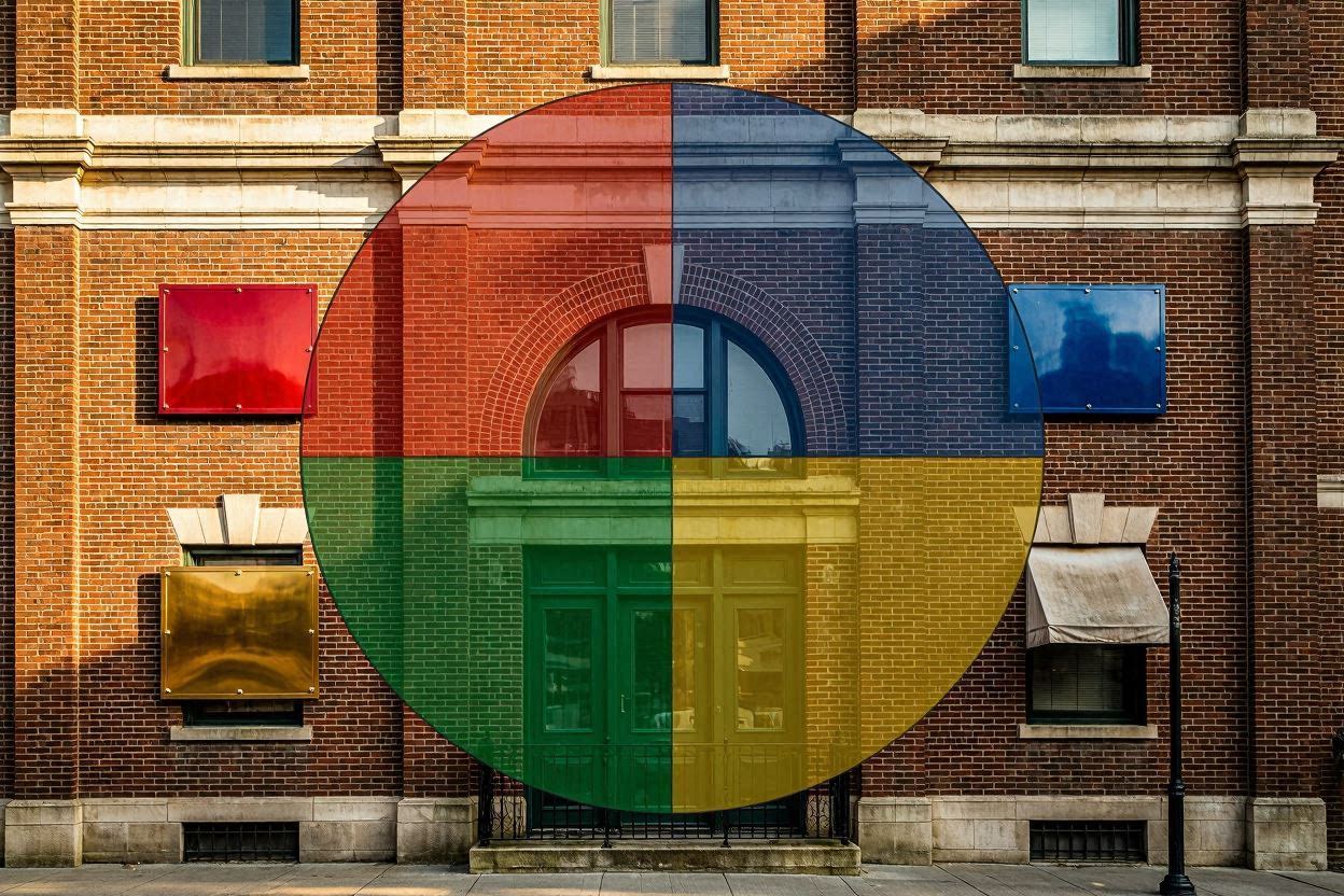
Colours are silent salespeople. The right palette can increase brand recall by 80%, while the wrong one can confuse or repel customers. Here's how to choose signage colours that work for your brand – not against it.
Red – Excitement & Urgency
Red captures attention instantly. It's great for sales banners, clearance signs, and restaurant signage (stimulates appetite). But overuse can appear aggressive. Use red as an accent, not the main background.
Blue – Trust & Calm
Blue is the most popular corporate colour because it conveys reliability, security, and professionalism. Ideal for banks, hospitals, IT companies, and law firms. Dark blue works well with white or gold lettering.
Yellow/Gold – Optimism & Premium
Yellow is highly visible (think caution signs) but can be overwhelming as a background. Gold, a richer version, signals luxury and quality. Perfect for highlighting logos or creating a premium feel on dark backgrounds.
Green – Nature & Health
Green implies growth, freshness, and eco‑friendliness. Used by organic stores, spas, and healthcare facilities. Dark green exudes wealth; lime green adds energy.
Black & White – Sophistication & Clarity
High‑contrast black‑and‑white signage is timeless and readable from a distance. It suggests elegance and minimalism – popular for luxury boutiques, galleries, and modern offices. Adding a single accent colour (e.g., gold) elevates it further.
Seasonal & Illumination Effects
Colours look different under daylight vs. night illumination. Warm white LEDs make reds and golds pop; cool white LEDs enhance blues and greens. Always test colours under the actual lighting condition you'll use.
Conclusion
Your signage colour should align with your brand's personality and the emotions you want to evoke. Need help selecting the perfect palette? Giocondo's design team can create colour mockups before you commit.
Ready for a Colour Consultation?
We'll help you pick signage colours that amplify your brand.
Book a Free Consultation →
Written by Giocondo Creative Studio
We blend colour psychology with engineering to create signs that work.
Let's Discuss →